- General
-
 Ideas
Ideas

0
Under review
Not-so-linear Library
So, this isn't really an issue per se, but something I would really love to see implemented if possible. The main library display screen to me, feels way too linear. I would really love to have a more squared display for the library screen rather than having to scroll down on every device. I have several libraries set up and plan to add more in the future, and I would really love if if it wasn't so straight. even adding two columns would be excellent. To give you a few examples;
My Library as it stands now, appears like this.
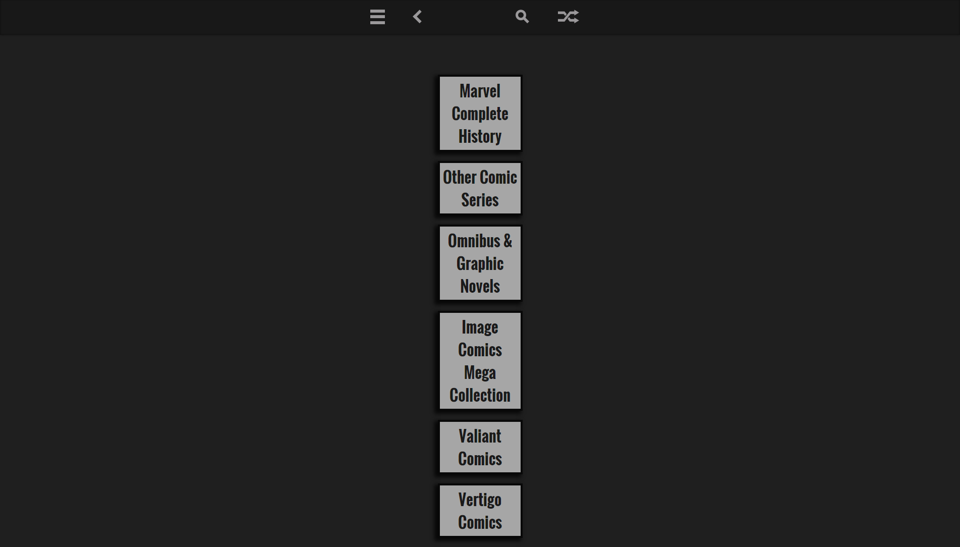
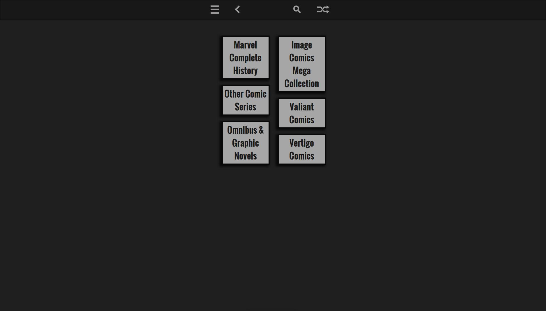
I would give anything for it to be like this if it's possible.
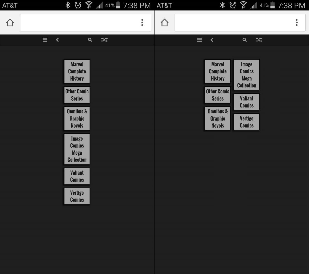
I think it would even be better on mobile.
Just a suggestion. It doesn't NEED to happen. But it would be amazing if it could.
My Library as it stands now, appears like this.
I would give anything for it to be like this if it's possible.
I think it would even be better on mobile.
Just a suggestion. It doesn't NEED to happen. But it would be amazing if it could.
Customer support service by UserEcho


Eg:
#group
{
    -webkit-column-count: 3; /* Chrome, Safari, Opera */
    -moz-column-count: 3; /* Firefox */
    column-count: 3;
}

.rootlink {
    font-family: "Oswald";
    font-size: 30px;
    display : inline-block;
    padding: 5px;
    background-color: #a6a6a6;
       border: #080808 solid 4px;
    color: #1a1a1a;
    width: 150px;
    box-shadow: -5px 4px 11px 2px rgba(0, 0, 0, 0.75);
    font-weight: bold;
    -webkit-animation: fadein 1s; /* Safari, Chrome and Opera > 12.1 */
       -moz-animation: fadein 1s; /* Firefox < 16 */
        -ms-animation: fadein 1s; /* Internet Explorer */
         -o-animation: fadein 1s; /* Opera < 12.1 */
            animation: fadein 1s;
}