- General
-
 Ideas
Ideas

Materialized theme for Ubooquity
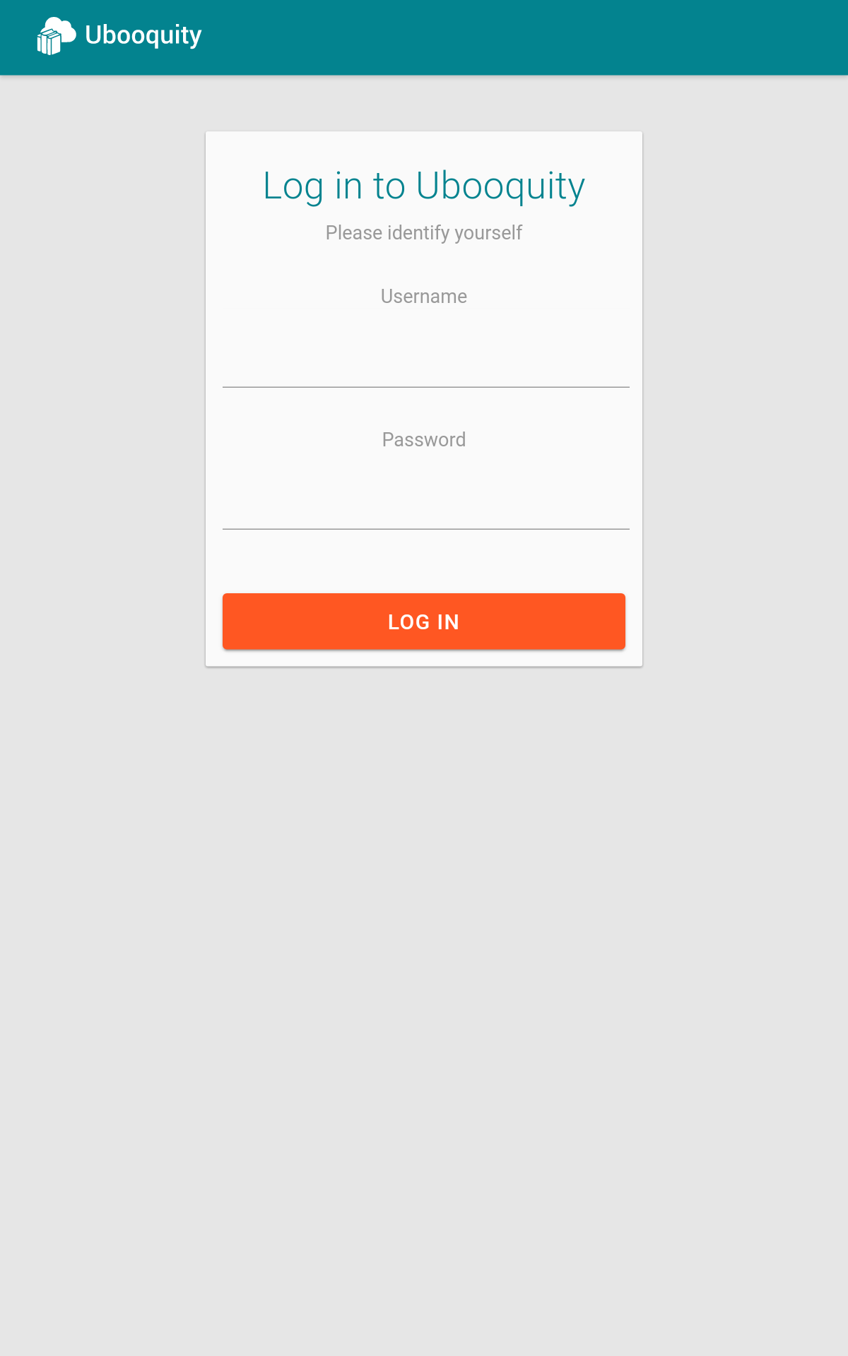
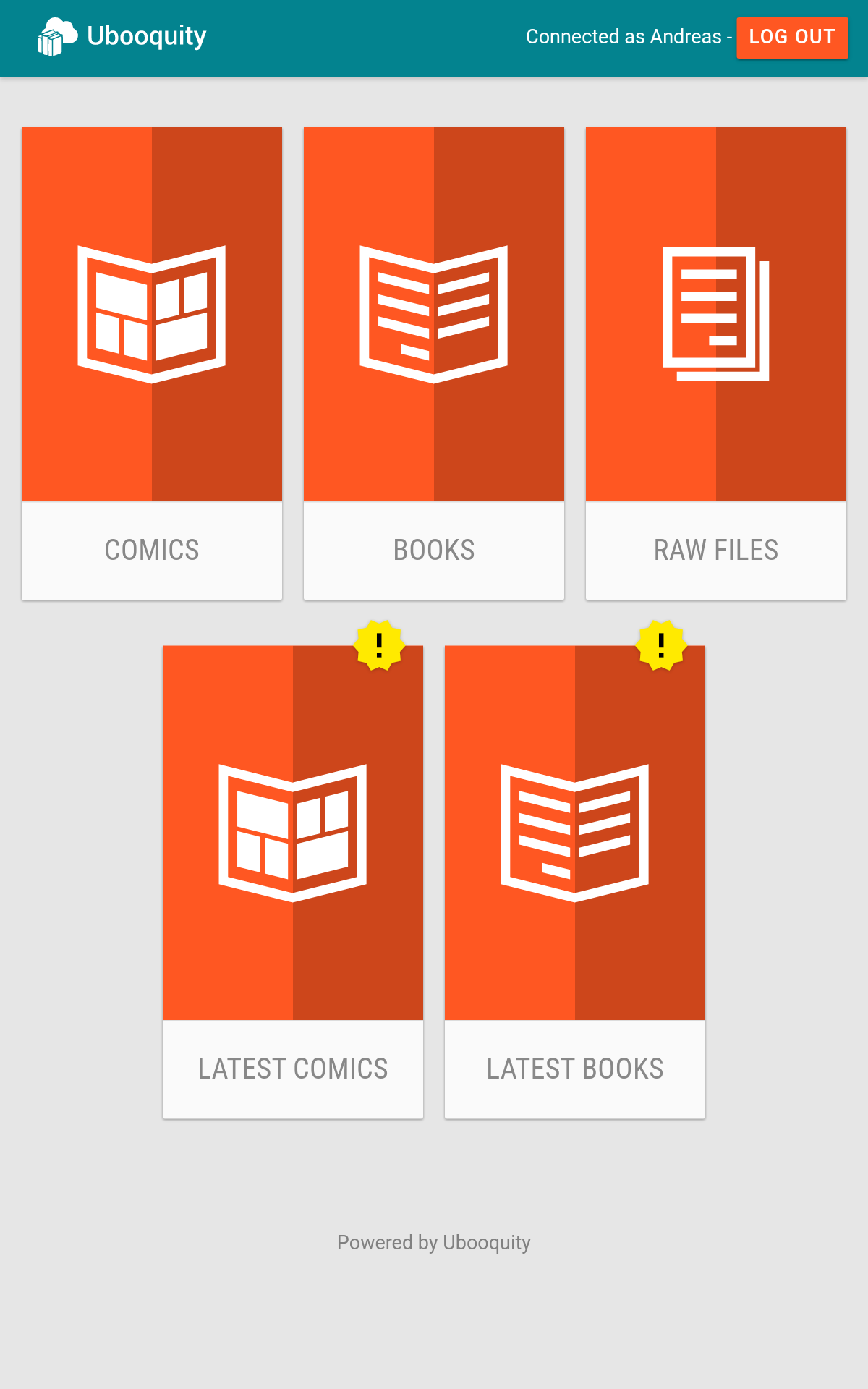
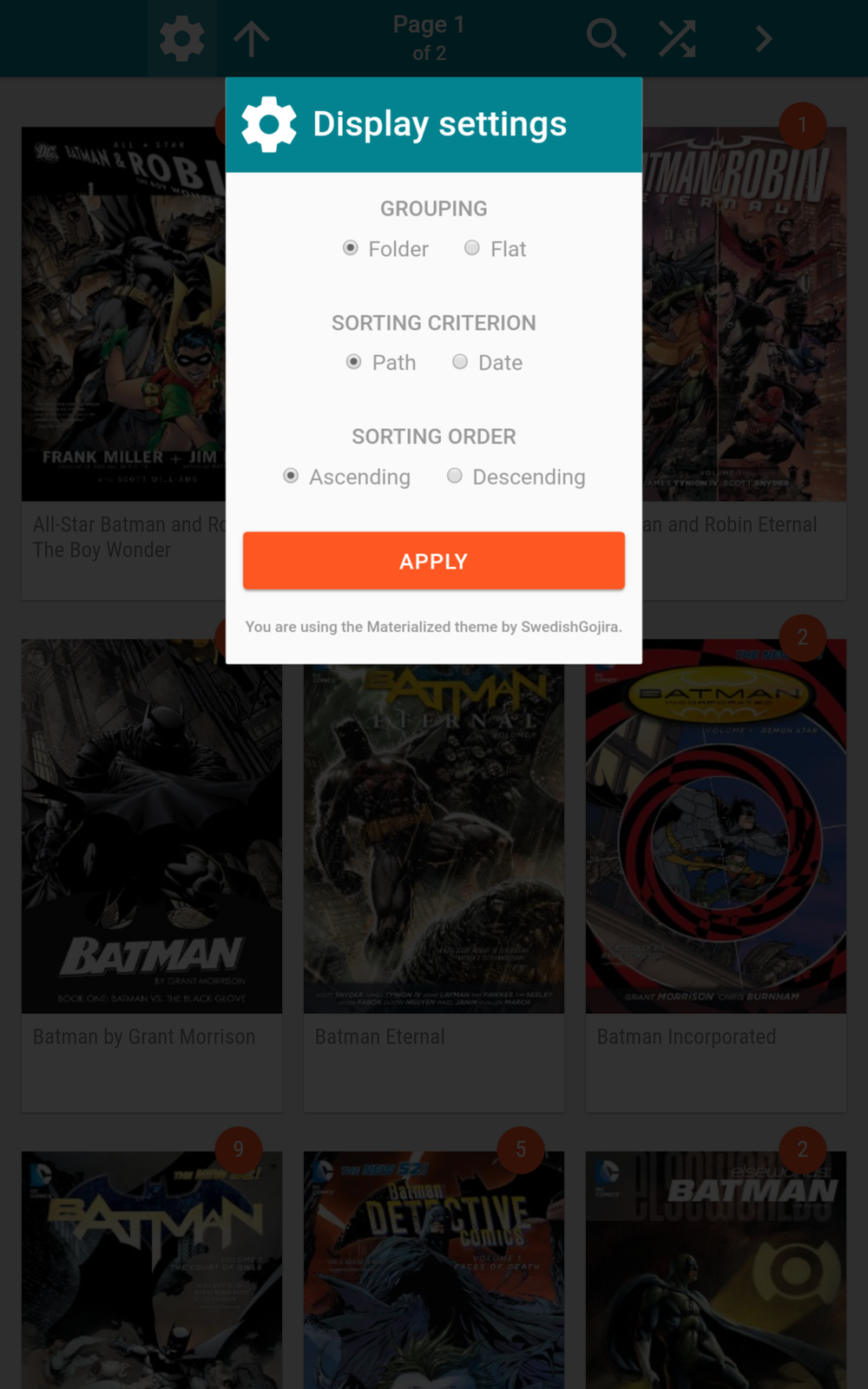
Here is my new theme for Ubooquity that I call "Materialized".
It is meant to mimic the material design look of Google, but with some small adjustments to fit my taste and sticking to the limits of theming the underlying code from the Ubooquity server itself.
I have made this mainly for my own use and it is using alot of hacky CSS to make it work and look the way I like it on my computers and my Android tablet. I was inspired by the "material-custom" theme that you may have seen before and kept some of the colors, but other than that this theme is lightyears ahead and most of the code and styling has changed.
This is meant for the 2.0.2 beta version of Ubooquity!
I have only tested it in the latest desktop versions of Firefox, Chrome and Safari and mobile versions of Firefox and Chrome on Android 7. I am not officially supporting any MS-browsers or old versions of the ones mentioned above.
The theme is 99% vectorized and only have two forced bitmap-images because of how Ubooquity works. If you know a little bit about CSS you can also customize the colors and effects of the theme by adjusting the file '/css/custom.css' to suit your needs.
See this as a kind of "beta" as I will probably do adjustments to the code even after this initial release. I already know it is not super great on phones yet, but that is probably my next step, and could use some javascript (see the next paragraph...)
If you have any experience with javascript please let me know. I know CSS, PHP and bash but have no knowhow of javascript at all and I have a few things I was hoping to be able to go around using javascript because I can not do so via CSS alone.
Download here: http://www.svalas.net/materialized-1.0.zip
Customer support service by UserEcho


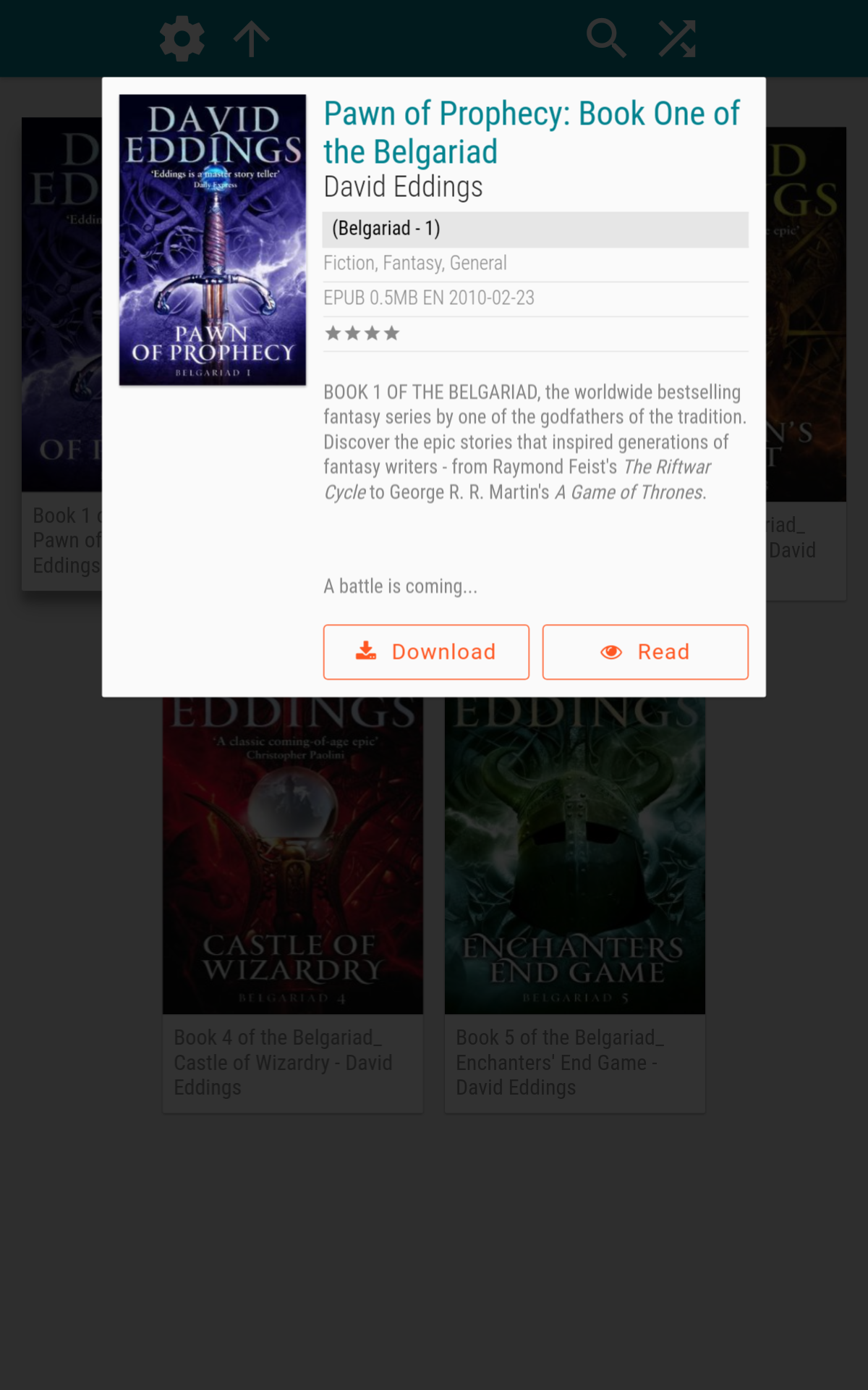
Damn! Out of nowhere, a new theme that looks super slick! And, it looks like your screenshots may all be from a mobile device, and you fixed the centering issue for the Read & Download buttons??!
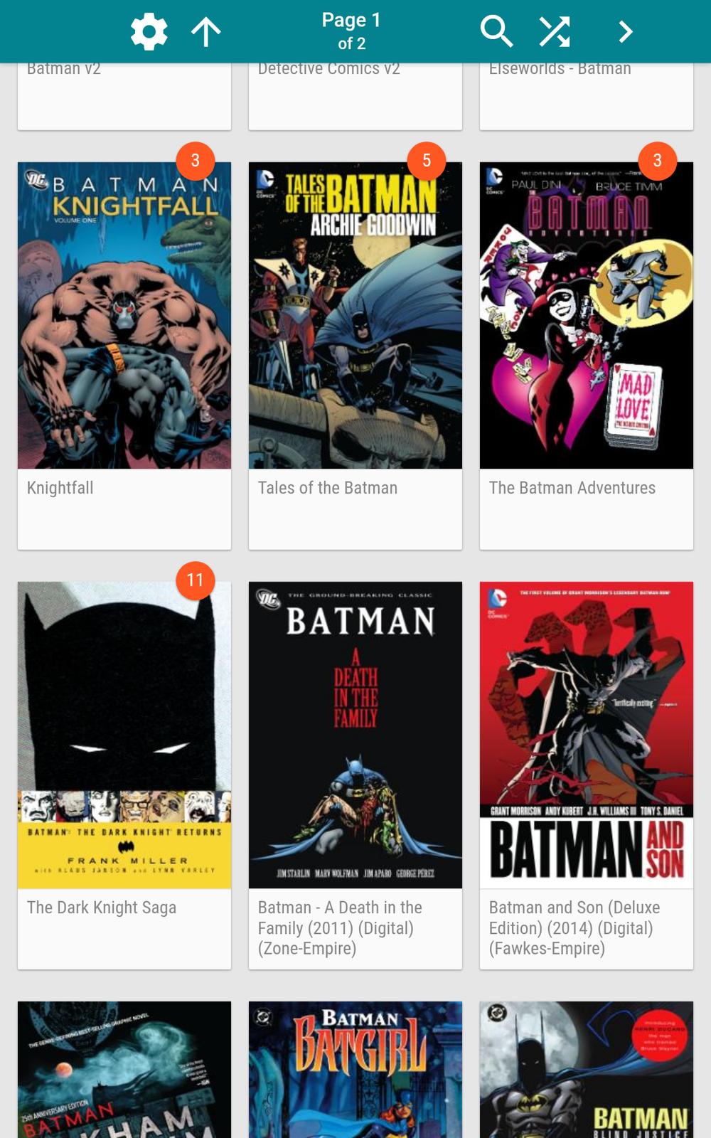
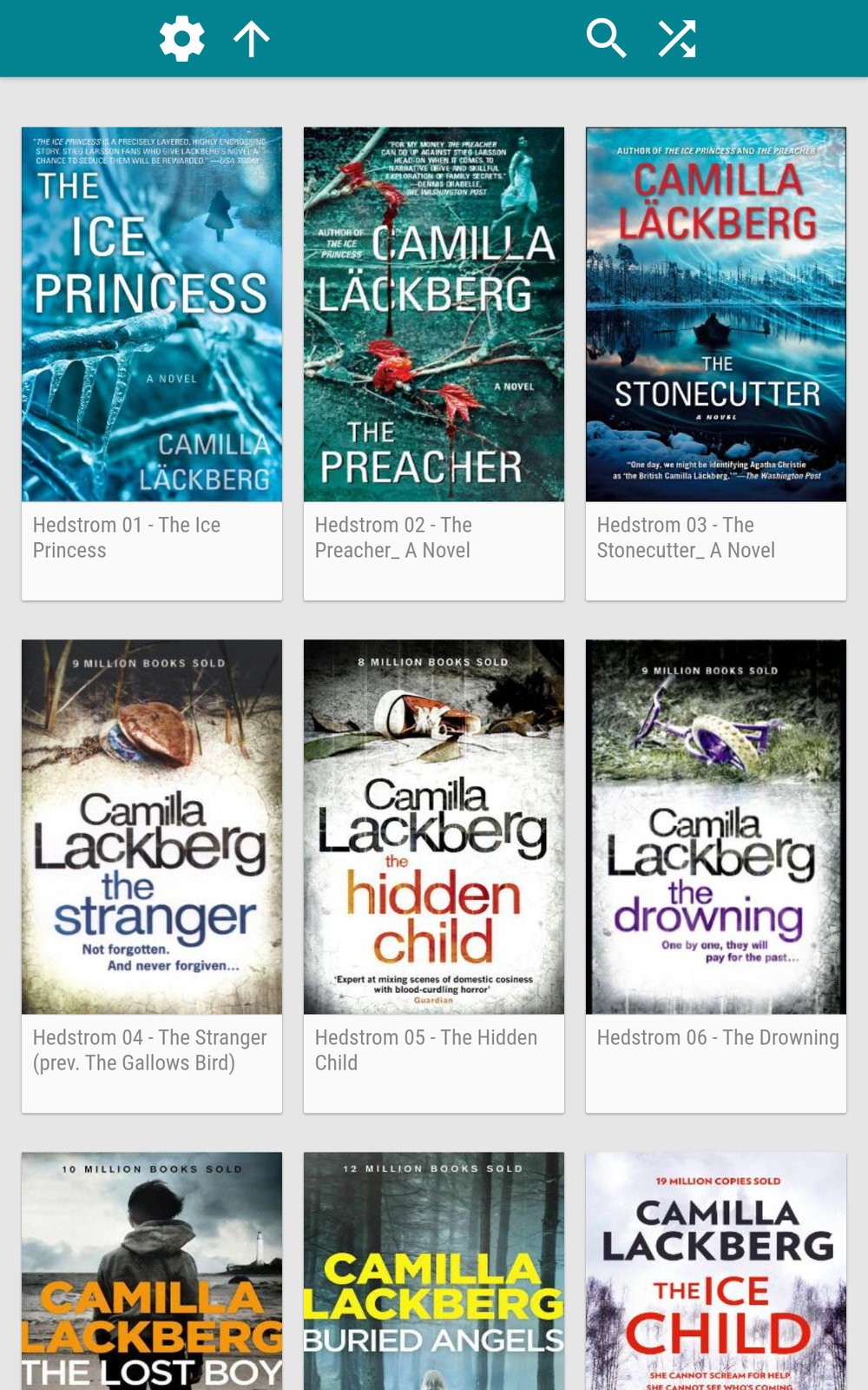
The screenshots are all from my 10.1" Samsung Tab A6 that I mainly use for reading my comics so that is what I'm designing for.
Happy to hear the positive comments :)
I do have one issue. Can you square out the Publishers page in the Comics? Actually, I organize my books in a similar fashion, so probably there too.
I pulled all of my folder images from Comixology, so they're all stretched now.
.thumb {
display: block;
width: 240px;
height: 240px;
}
.thumb img {
display: block;
width: 240px;
height: 240px;
box-shadow: 0 1px 0 rgba(0,0,0,0.12);
}
I changed both of these in the comics.css file, to square it out.
There's no pic of your Publisher page up there, so not sure how you organize and what you were seeing.
There is really not any specific "publishers page", that is something the editor of the Comixology theme hacked in for his theme.
With your edit all cover images will be square.
As of now I can not set different dimensions on the cards. Also I use multiple levels unlike what the Comixology theme use and my folder pictures are not square.
I might add something in the future in the custom settings though.
I insptected the Default theme to see how it handles this actually. Had to set it to the below:
Looks like HTML maintains the images aspect ratio, so only allowing a square image's width to 160px, keeps it from stretching.
-- Add "max-" to the width & height, and set its max to the same as the cell size.
.thumb {
display: block;
max-width: 160px;
max-height: 230px;
text-align: center;
}
.thumb img {
display: block;
max-width: 160px;
max-height: 230px;
box-shadow: 0 1px 0 rgba(0,0,0,0.12);
}
And I went with the Default theme's cell size, to allow more to fit on the screen at a time.
-- Determine the full cell size
.cell { position:relative; float: left; width: 160px; margin: 10px 10px 20px 10px; background-color: #fafafa; border-radius: 2px;
}
If you added any custom setting, I think the cell width is all you'd need to change.
The "Publisher Page" isn't really hacked in, it's just my main landing page since that's how I organize my comics.
\\comics\Publisher\Series\issues
Well, doing it like that you will get varying heights of the cards depending on size of the covers/folderimages, and that would go against the material design idea of uniformity.
Also changing the width to 160px would make the titles very much unreadable to me.
I will add an option in custom.css to make ALL folders square, but I'm not changing any widths or heights as that would compromise the readability of the theme.
I just released an updated version 1.0.2 where I have added settings to make all folders square and another setting to also have square icons on the homepage.
You can find the settings in /css/custom.css at the bottom.
http://www.svalas.net/materialized-1.0.2.zip
Very quick and nice turn around. Great job! :D
looks nice!
Very nice indeed !
I have updated the theme list on Ubooquity website to include it.
Yes I like very much !!
But there is something I don't like... Some of my cover don't look nice because they are stretched.
Some time ago I used the material theme to make something more like what I wanted (and specially to correct the bad stretched cover...). I am not good about html and css, but I made some search on the net and I could correct this.
Look the cover for "Mickey (L'age d'or de)":
With your theme, it is ugly because it is stretched. I could correct this, there is some grey space around the cover, but I prefer that to the stretched cover....
Well I have seen it is possible to make the cover fit with custom.css. Very good !!
But there is something else. I don't know if you make it specially or not, but only the folder can become square, not the comics or books.
In this picture in one of your post, we can see it. Is it possible to have only square cover ?
I think the more important question, is why would you want the comics squared?
And how would you have them squared? Cropped? But cropped to where? The titles in your example are all at the top, but that isn't always the case.
I don't think there's a uniform way to do what you're asking.
Updated theme: materialized-1.0.5.zip
Please guys, no need to frankenstein a solution with CSS from other themes or edits of your own. Just tell me about your requests and I will see if I can add a solution to the "custom.css" file.
StudioNeuneu: There are now two different options to solve your problem in the "custom.css" file. One that will give you proportional covers and consistent cards, and one that give you proportional covers with inconsistent cards. Just uncomment the one that you feel is right for you.
There is also options now to make all covers+folders square. By default they are cropped from the top, but there is also an option to have centered images. I would not recommend the latter though as it looks terrible.
Enjoy!
Hello !
I just see you have anwered to me !!!
Thanks. I will try your new version.
While I'm not an Android user, I really enjoy this theme and appreciate the work that went into it. However, I have one small issue. In Safari, on the iphone, the navigation controls near the top aren't visible.
They're clickable, just not visible. This is not an issue in Safari on the iPad.
(Edited - I just re-read the first post in this thread and see that you mentioned it may need some work on phones. My apologies. This is the only issue I've encountered. Everything else is working great.)
I'm sorry, but I have no iPhone to test with so I have no idea of why it is not working for you.
Weird that the iPad can show it properly but not the iPhone. I have a suspicion this might be a retina-screen related thing, but I can only guess. What version of iOS are they both on?
Both are running 10.3.2
I will check with my friends phone tomorrow. Can't do much now anyway.
I haven't tried the theme personally yet, but after scrolling through the screenshots all I have to say is; F*** YES, The MOTHERF****** BELGARIAD! Best books on earth! David Eddings is the S***!!!!
Yes, they are awesome! I have them both in Swedish (since I am Swedish) and english editions in my bookshelf :)
Not having any invisible buttons here on iPhone. Sorry, but I think you might have a caching problem or something.
You could try to clear your cache: https://discussions.apple.com/thread/7489010?start=0&tstart=0
Another thing to try is to go to the settings for ubooquity and choose the default theme, restart, and then choose the materialized theme again and restart. Sometimes I notice that ubooquity is not serving the correct theme files.
Andreas, I found the issue. My ad blocker is preventing the navigation controls from loading. When I whitelisted my domains (both my dynamic DNS and my internal IP) the controls reappeared.
Any chance you can also add the publisher / story arc / etc functionality of the Comixology Theme? Your theme is amazing but that functionality is crazy good. Having both things would be just perfect.
Sorry, but that is a big NO. Those functions are not standard functions of Ubooquity, take too much time and are way to 'hacky' for me to bother with. Also I don't know how to code javascript, and I think that is how Scott did it.
Ok, fair enough. Thanks for the great theme.
New update! materialized-1.0.7.zip
The custom.css file now has a "dark mode" that you can uncomment to enable. This makes the theme more gentle on the eyes at night and might save some battery on certain screens. Popup-windows and login is not darkened to keep readability good.
Hello.
I saw there was a new version of Ubooquity (2.1.0). I also saw there is a new version for your theme. So I downloaded both of them, but now there is something wrong with the raw files.
I think there is some change with the new version of Ubooquity, because if I use an old version of your theme, I also have the problem...
Ubooquity 2.1.0 and Materialized 1.0.7, same issue, just in raw files.
I just installed Ubooquity 2.1.0 with materialized 1.0.7. No issues so far so I'd say there is no compatibility issues.
Guys, 2.1.0 was released three days ago and the latest version of my theme was released a full week ago. Something has changed in the base code of ubooquity, I just need to figure out what has changed (it's not really documented anywhere) and update my theme to match. I will release an updated version later in the day.
New version updated for Ubooquity 2.1.0: materialized-1.0.8.zip
The Raw files section looks a bit different now as I had to adapt it around the new code that Ubooquity spits out.
I also had to rewrite alot of the "Dark mode" from the previous update and move the css for it to the top of custom.css to work correctly.
Enjoy!
Just to be sure, for the future, these updates are always intended to be overwrited over the previous version? Because when I removed the previous version and copied files from 1.0.8 some symbols were missing (like the gear, the folder icon, the "!" badge). Then I copied over an older version without replacing the new files and now all looks fine.
Great work by the way!
A suggestion: would'nt be possible to add a "home" shortcut in the nested pages, along with the "back" button? Is this outside of what can be done with the theme?
Sorry, the missing icons is caused by a packing error in the latest version. Just unpack it over the previous version and it will be fine. I packed this remotely as I just got a new laptop and has not had time to set it up properly. I will fix it later today.
I have repacked the latest version (materialized-1.0.8.zip) now so it is correct with all files included.
About a "home" button, I might be able to add it with some more hacky css. The themes are mainly for styling what is already output by Ubooquity so adding things is sometimes difficult.
Someday, Ubooquity themes will also contain HTML templates with variables (using Mustache) so that the structure of the page itself can be customized.
Someday...
Wow that soon? You're the best, Tom!
Nice try. ;p
firstly I love this theme.
however, the font seems too big and I can't see the whole directory name, ven for moderately small directories.
That is the first I have heard of this problem so I don't know why you would have this problem as nobody else have it.
Post a picture to show your problem please and give me aome details of what browser you use.
there you go, seems you can only fit 10 characters
I mostly use Chrome
I see your point. I don't believe that is how most people sort their comics, I for one keep all my comics in one source, and never have the problem you have. I might expand them a bit for my next release, or make it a custom config option.
I love this theme and all of the different ways of customizing it you've added. One thing that has been an issue is the quality of the covers of books and comics. They are very low-res. Is there a way to fix this?
Thank you! Always nice to hear that people appreciate my work :)
This has nothing to do with the theme, but your settings for Ubooquity.
Go to the admin interface and up the resolution on the thumbnail size for your comics/books.
You may have to press "Clear Comics database..." and rescan your whole collection to refresh the thumbnails with higher resolution.
Thanks! I had trouble getting to the admin page but I got it now.
I love the looks of the theme, But it appears the download links are broken. Any chance we can get an updated link?
2 years later, but here's a mirror to 1.0.8 https://drive.google.com/file/d/1mAp5HgnBGLfTil3ekKz15d1iJwXh3XNA/view?usp=sharing